


As such, your PCA has the power to cement your advertiser relationships by deepening inventory buy-in with each campaign. Moreover, since there are many less-than-great PCAs out there, you can create a competitive advantage by offering a real source of value. Sound like a stretch? Keep reading; we think you’ll agree by the time you get to the end of this blog.
Let’s start at the beginning. What’s the difference between a strong PCA and an average one?
After reviewing many PCAs, we found that the strongest ones got 3 things right:
-
- Meaningful content based on rich data and granular segmentation (in other words: shit in, shit out). Explore what meaningful data looks like and partner up when needed.
- Simple communications and design: well-distilled information, clear data visualization guided by written summaries, and an easy-to-navigate document
- Strategic focus including a call to action, to encourage your advertisers to book your inventory for their next campaign
This blog reviews the 5 sections every PCA should include, in chronological order:
-
- Campaign Goal
- Performance
- Executive Summary
- Insights
- Suggestions
Let’s jump right in.
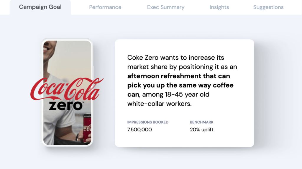
Section 1: Campaign Goal
This section should answer a single question: ‘what does good look like?’. The answer should, of course, align with the goal your advertiser outlined in their campaign brief.
When reiterating their goal in your PCA, make sure to include 2 things:
-
- Written campaign goal – what is the advertiser looking to accomplish with this campaign? Keep this short; one or two sentences max. Bold the key statement to help the reader scan.
-
- Engagement benchmark – what is the baseline expected outcome (e.g. 20% uplift)? We’ve seen a lot of PCAs that didn’t include a benchmark. Without a benchmark it’s impossible to analyze performance, because there’s no measure of success. If your advertiser provided a benchmark, use that number. If they haven’t, you’ll need to develop your own. When doing so, make sure your chosen benchmark provides meaningful insight: if every target outperforms your benchmark by 500%, it’s difficult to gauge which targets were a meaningful win.
The result may look something like this:
Section 2: Performance
Once we’ve established what good looks like, we’re ready to assess campaign performance. To make your performance overview intuitive and easy to interpret, create two elements: a summary (which shows overall campaign performance) and a breakdown (which shows the performance of individual targets).
The summary should include total average performance (e.g. 28.9% uplift) and the percentage of increase/decrease vs. your benchmark (e.g. +8.9% vs benchmark). Give this element a coloured background to create dominance and draw the eye in (a simple design hack that will make your readers appreciate any document).
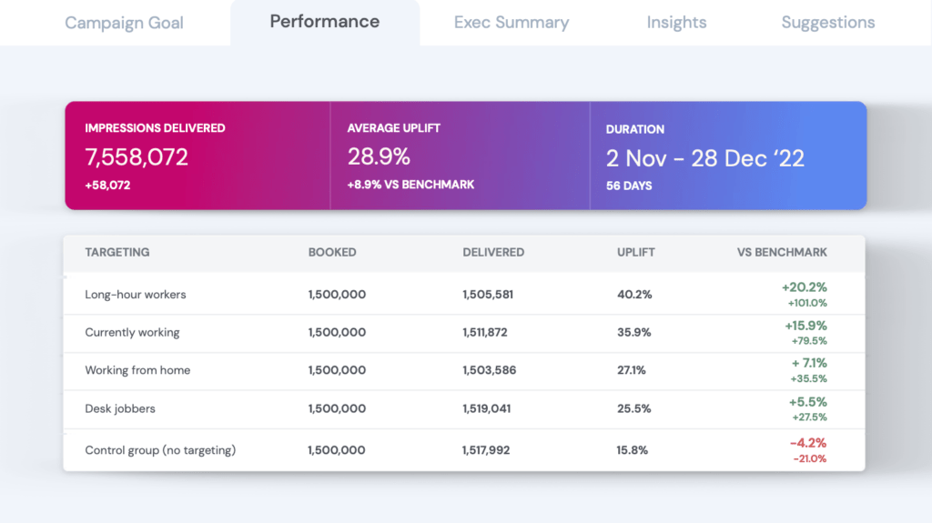
The breakdown section should list each of the targeted segments, ranking from highest to lowest performance. For each segment, specify:
-
- Number of impressions booked and delivered
-
- Performance
-
- Performance vs. benchmark
-
- % over/underperformance vs. benchmark
Color-code comparative figures to give your readers an instant impression of what performed and what didn’t (e.g. green and red).
If you don’t do so already, consider including a control group segment (this could have a proportionally smaller number of impressions). While advertisers will primarily assess your inventory’s performance by comparing it against their benchmark, adding a control group is useful for two reasons:
-
- It acts as double verification, allowing you to prove the superiority of your targeting capabilities by showing how much your targeting outperformed spray and pray
- Since control group performance data covers your entire user base, it can highlight high performing demographics or contexts that you didn’t anticipate but are worth trialing in future campaigns
Before we move on to writing the perfect executive summary: if you like the example PCA we use in this blog, you can download the free Google Slides template here and follow along while populating it with your own data.
Section 3: Executive Summary
Your executive summary should sumarize the most insightful findings from your analysis in a few easy-to-understand nuggets. Each nugget should offer your advertiser immediate value by suggesting which targets (and specific sub-categories) had the highest performance. They should be written as stand-alone statements, as some readers will jump to this section with no prior reading.
A good sentence structure for targets with 0, 1, and 2 sub-categories, respectively, is:
-
- [Target A] had the highest engagement
-
- [Target B] engaged most during [daypart A]
-
- While [activity A], [target C] engaged most during [daypart B]
If your nuggets are much longer than this, they may include multiple insights and require further breakdown. Remember: simplicity is the name of the game.
If your nuggets are all of the single variable format, your PCA may lack meaningful insight. That would suggest revisiting your first party data strategy, and seeing how you can recruit more audience intelligence. This is where we come in: if you’re curious about accessing the insights used in this blog’s sample slides, you can see the full list of behavioral data points we provide or book a demo to learn more.

To go the extra mile, link each nugget to the relevant insights page so your readers can jump to items of particular interest.
Section 4: Insights
As the name suggests, the insights section should provide wider insight around the nuggets you’ve shared in your executive summary. If you mentioned that “long-hour workers had the highest engagement”, you’ll want to include an insights page with a graph that shows engagement across all targets. If you mentioned that “desk jobbers engaged most on their morning commute”, you’ll want to plot desk jobbers’ engagement across all other activities.
Make sure to always plot impressions alongside your engagement metric. Like that, your advertisers can see total engagement if they want to optimize for scale, and engagement/impression if they want to optimize for budget.
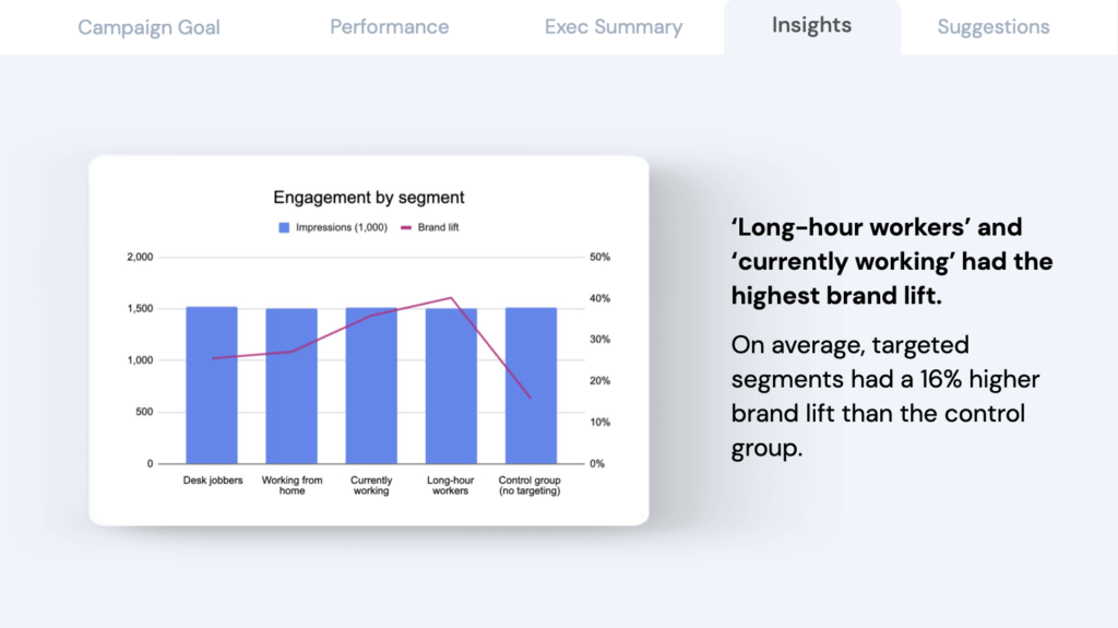
Always include a written summary of the 1 or 2 take-away(s) that you want your readers to remember. We suggest talking about engagement rather than engagement/impression here, to avoid your advertisers getting excited about a cost-effective target with a high engagement/impression that you won’t be able to deliver at scale.
In terms of design, never display more than one graph per page. Not unlike commercial products, documents deliver an experience – and pleasant experiences lead to better conversions and retention (of clients or readers alike). If you’ve read this far, you’re invested in delivering a strong PCA – don’t lose your readers to information overwhelm.
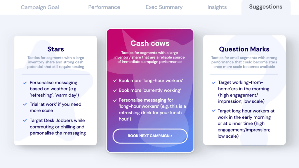
Section 5: Suggestions
Your suggestions section lays the foundation for your advertisers’ next campaign. Out of all the insights from your PCA, this is the most important section as it has the power to directly increase your advertisers’ return on investment (and inspire them to book their next campaign with you).
To classify suggestions in a meaningful way, we loosely adapted 3 concepts from the BCG matrix:
-
- Cash cows (milk): tactics for segments with a large inventory share that are a reliable source for immediate performance. While these no-brainers will generate immediate results, they can’t sustain long-term performance growth as they are relatively mature.
-
- Stars (invest): tactics for segments with strong potential and a large inventory share, that still require some testing to be nurtured into performance. As such they aren’t yet cash cows, but will typically float the next phase of performance growth.
-
- Question marks (keep an eye on): tactics for high performing segments that aren’t scalable at the moment, but could become stars once more scale becomes available.
Your cash cows are the slam dunk, and essentially the personalized selling proposition for your advertisers’ next campaign. Emphasize this section by giving it a colored background.
To encourage your advertisers to book your inventory for their next campaign while they have your suggestions top of mind, include a call to action such as ‘book next campaign’ that links to a pre-populated email to your account manager.
That’s it! Quite straightforward when you distill it to the essentials, right?
Let’s recap the key take-aways:
-
- Make sure your first-party data is rich enough to provide interesting, aha-type insights across audience targets
- Always start with an engagement benchmark (e.g. 20% uplift): it’s impossible to analyze performance without a definition of what good looks like
- Add a control group that covers your entire user base to highlight additional high-performing segments that you hadn’t anticipated
- End with inventory-specific suggestions for your advertiser’s next campaign, encouraging them to book it with you
- Adopt design best practices such as colored backgrounds to create information hierarchy, writing in short and jargon-free sentences, and adding links to make your document easy to navigate
About NumberEight
NumberEight brings your first-party data to the next level by infusing your inventory with mobex (mobile context). Mobex includes your users’ live context such as their activity, situation, and daypart; as well as off-the-shelf audiences targets based on hobbies, sleeping patterns and transportation habits, among others. This allows you to deliver top-of-the range campaign performance and jaw-dropping PCAs that turn advertisers into lifetime customers.
To see a full list of the contextual signals we provide, you can download our taxonomy here. If you’d like to see how our privacy-first insights technology works, please book a demo.
Did you like the example PCA we used in this blog? You can download the free, fully customizable Google Slides template here.


